Responsive Website Templates


 90
90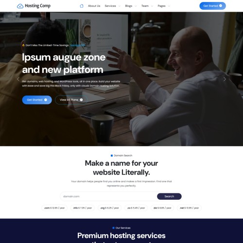
 12
12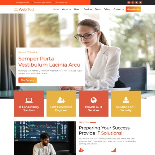 204
204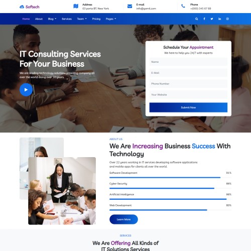 210
210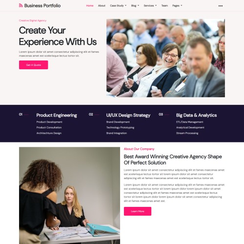
 115
115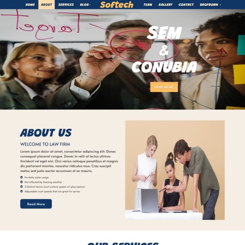 107
107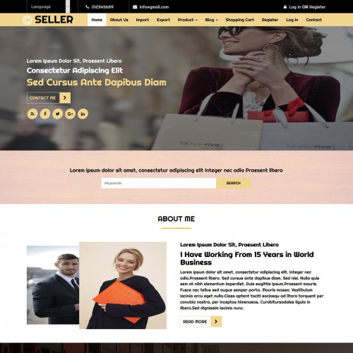 763
763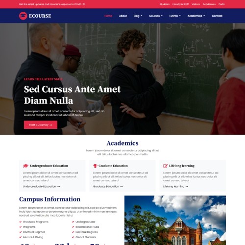
 212
212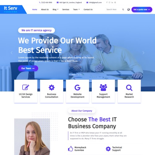 211
211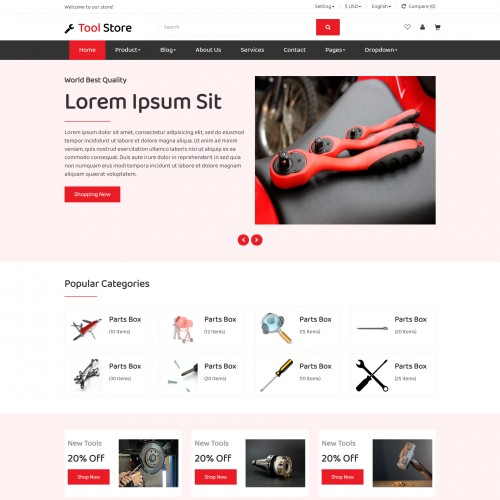
 871
871

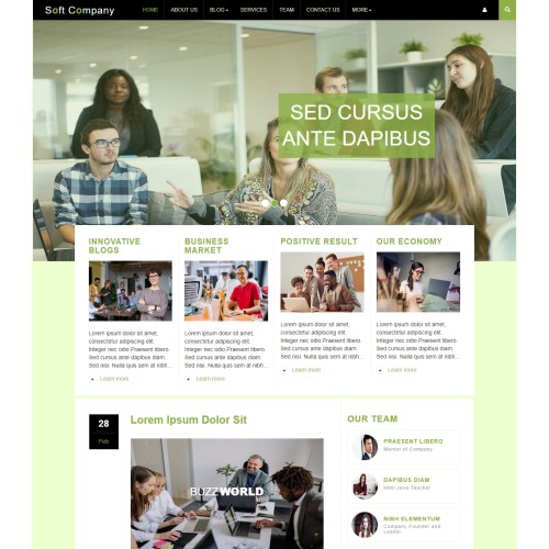
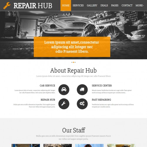
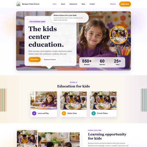
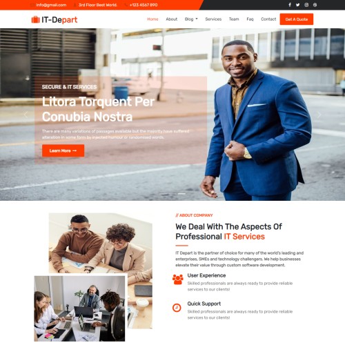
A responsive website template is an HTML5 + CSS3 (often Bootstrap 5) template that automatically adjusts layouts, images, typography, and navigation for different screen sizes. Instead of building separate sites for mobile/desktop, one template adapts to all.
These templates are crafted to ensure smooth adaptability on every screen size, from large desktop monitors to handheld smartphones. Built with modern frameworks like HTML5, CSS3, Bootstrap, and jQuery, these templates ensure that your website looks professional, loads fast, and provides a smooth user experience across devices.
Perfect for business websites, portfolios, blogs, eCommerce stores, startups, and personal projects, these templates save time and effort while giving you a mobile-friendly, SEO-optimized foundation. With ready-made layouts, customizable sections, and modern design elements, you can launch your website quickly without coding from scratch.
Whether you want a corporate site, creative portfolio, online shop, or landing page, responsive templates offer flexibility, performance, and compatibility with all major browsers and devices.
Key Features
- Mobile-first grid system (12-column layout with breakpoints)
- Fluid images & media (max-width: 100%)
- Flexible typography (viewport-based units, rem/em scaling)
- Responsive navigation (hamburger menus, collapsible navbars)
- Touch-friendly elements (buttons, sliders, forms)
- Cross-browser compatibility
- SEO-friendly semantic HTML
- Use Bootstrap 5 or CSS Grid/Flexbox for layout.
- Apply media queries (@media (max-width: 768px) { ... }).
- Include meta viewport
Typical Pages in Responsive Templates
- Home - Hero banner, services, highlights.
- About Us - Story, mission, team.
- Services / Products - Cards or grids adapting to screen width.
- Portfolio / Gallery - Responsive images, lightbox integration.
- Blog / News - Masonry or list layouts, adaptive sidebars.
- Contact - Responsive form + embedded map.
- Extras - 404 page, FAQ, pricing tables, testimonials.
Categories of Responsive Templates
- Business & Corporate - Clean and professional.
- Creative & Portfolio - Showcasing projects visually.
- E-commerce - Product grids, mobile-friendly cart.
- Landing Pages - Conversion-focused.
- Education & Non-profit - Courses, donations, causes.
- Entertainment & Events - Schedules, tickets, galleries.
- Blog & Magazine - Flexible content layouts.
- Personal/Resume - One-page scrolling style.


